Following man’s first ascent of Mount Everest in 1953, Rolex more than ever associated itself with pioneers in sporting endeavour and exploration.
The first “Explorer” models appeared little different from many other Oyster models, but in the early 1970s Rolex introduced the “Explorer II.” This model came in a robust, professional series case but with an independent, red or orange 24-hour hand to indicate the time in 24-hour format against a fixed, outer bezel. This was deemed useful for those who might be underground like speleologists (cave explorers), or perhaps those at polar extremes, where night and day can merge into one.
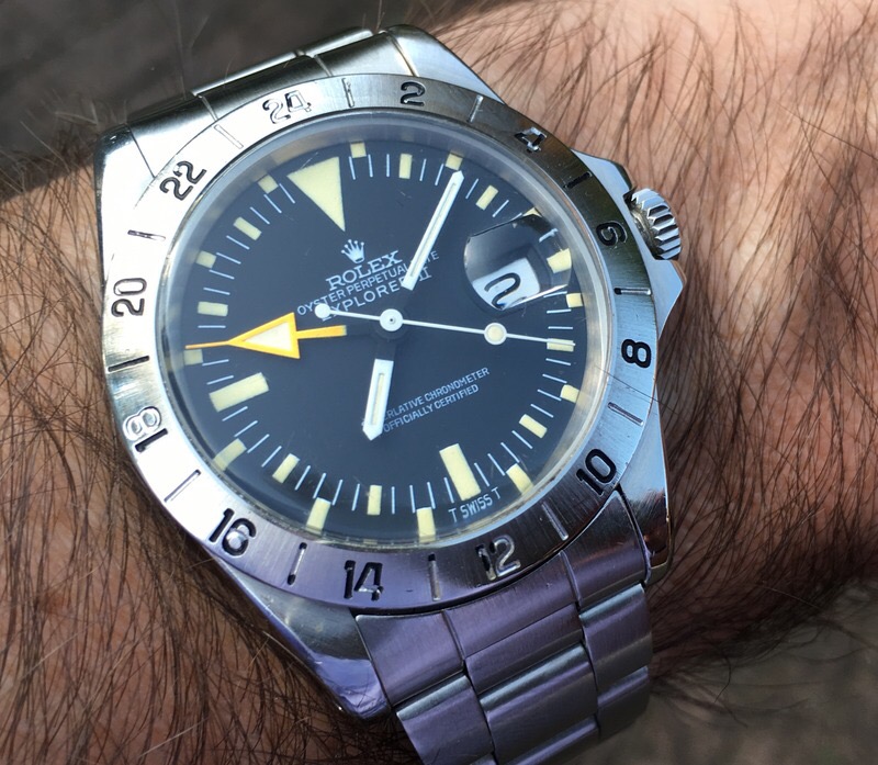
This 1655 has a case number in the low 4-million range, being from the mid-1970s.
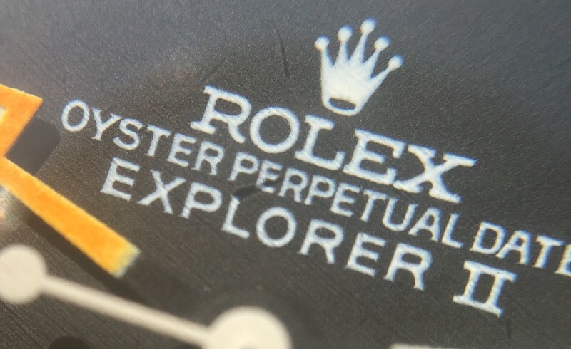
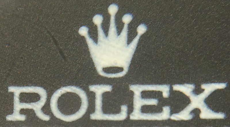
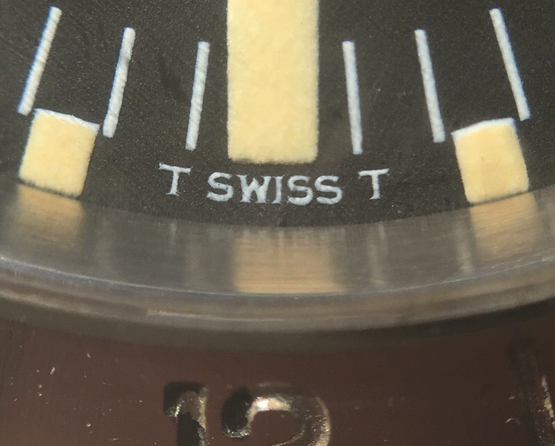
It’s the Mark 2 dial with “frog’s foot coronet,” made by a company called “Stern.” The nickname for this version of the dial celebrates the peculiar design of the Rolex logo, which looks rather like a frog’s foot (also found on contemporary examples of the model 1016 Explorer / “Explorer 1” ).
There is a second version of the frog’s foot dial, with the SUPERLATIVE CHRONOMETER OFFICIALLY CERTIFIED text coinciding so that the gaps between the words are vertically aligned in what is known as “rail” format. If you have one of these, please contact me – I would be delighted to use similar pictures of your dial and credit you for them within this article.
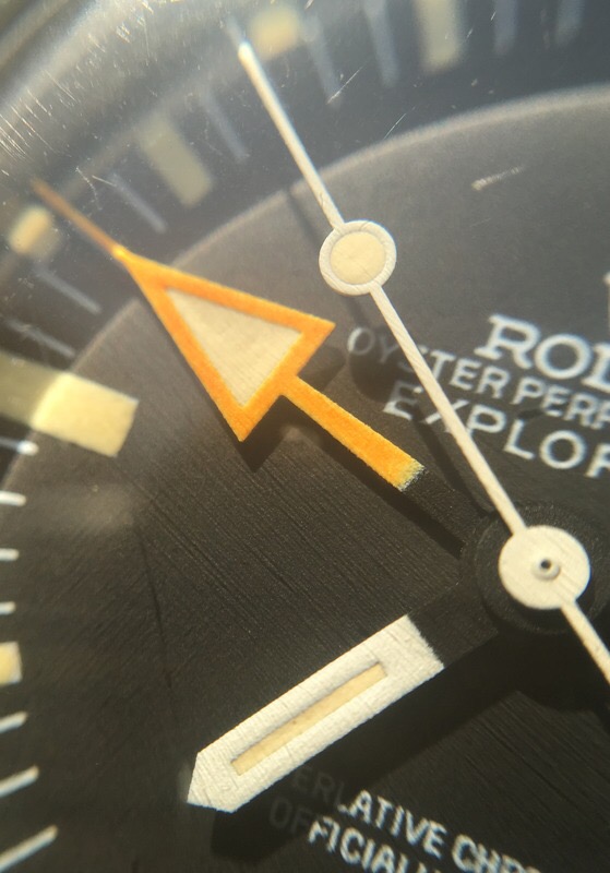
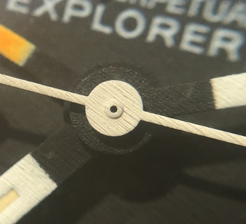
I find the details of the dial and hands rather clumsy and distracting, certainly not as functional as I would wish from a tool watch:
Perhaps as a result we have only two of this model in Miltons’ special selection. We can still celebrate their rarity and quirkiness, even if the “disco dial” won’t ever be the easiest daily wearer.
You can see in the bottom of the picture above how the black enamel has worn away from the numerals of the “12” on the bezel, which is a very common phenomenon. Many have been replaced with later, slightly different bezels at service. Even if well worn such as this one is, I find the original bezels with their fuller figures and stumpy “1” more pleasing than the thin-type replacements. All, of course, are prone to showing wear if used as intended.
Please ignore the apparent graining effect in some of these images, caused simply by the macro lens of our camera picking up polishing tracks in the acrylic glass of the watch.
Like all Rolex sports models from the period, the value of the 1655 Explorer II has steadily increased. I am always keen to buy nice examples!
Haywood Milton, June 2016

